
the Design Cauldron: June
I can’t believe we’re in June already! Wow! What inspiration is stirring you? Here are some recent discoveries that I was instantly drawn to and saved.
Muted Color Palettes
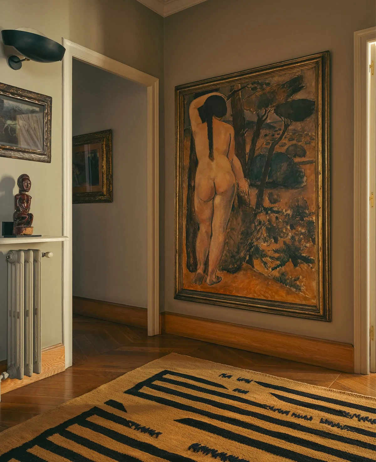
Doesn’t this large nude remind you of our Diana! Gallerist Miquel Alzueta’s home in Barcelona photographed for a Studio Ko x Beni Rugs collaboration has many places for the eye to roam: natural wood skirting/baseboards, artwork, muted colors, the shelf above radiator…

Diana the Huntress, Paul Savitt 1964
Grass is always greener on the other side, right? Probably not because I would go mad without color, but that doesn’t stop me from admiring the restraint of others. Here, the architecture and decor do doing the heavy lifting, with standout pieces that really demonstrate the designers’s eye. I really love unique pieces that tell a story.
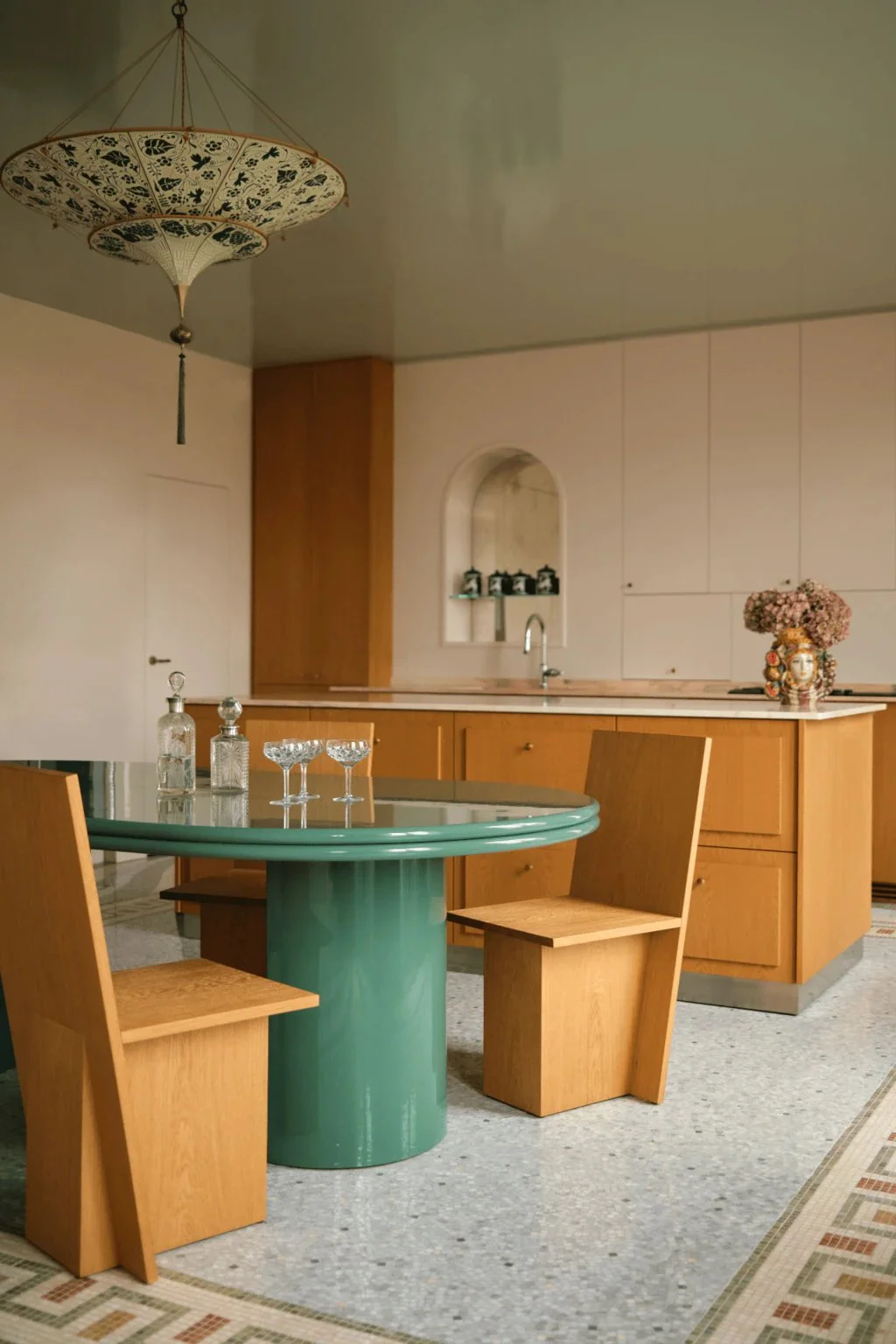
This eat in kitchen by French design duo Hauvette & Madani is so calming. You really can’t go wrong with a color palette found in nature: pink, green, and brown. I love the glossy ceiling — a trick we wanted to employ in our living room to brighten it up, but it being in a rental, we settled for a coat of semi-gloss paint. I love the effect of light bouncing off the ceiling and the colors of the room reflected upwards. Special touches: the bar and glassware, the pendant, the tile work reminiscent of flooring in Venice, and the vase full of hydrangeas.
The Fortuny silk chandelier pendant reminds me of one of my favorite Ingo Maurer pendants, Floatation. Crate and Barrel have a less expensive “inspired” version by Athena Calderone. And West Elm has an even cheaper version. I love love these hand blown glass wine glasses, too.


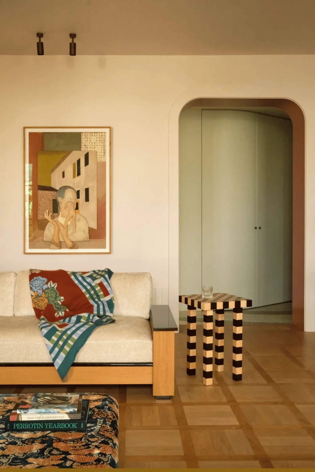
I never tire of archways or checkerboard patterns.

Gallerist Miquel Alzueta’s home in Barcelona

Our dining room prior to latest makeover. I have renewed respect for my choices!
I also never tire of green interiors. Soft off-white walls are really fantastic, but so are green ones! Even in muted tones like the walls of fashion designer Giambattista Valli Parisian flat on the Ile Saint-Louis.

I love that the soaring walls aren’t covered in art and your eyes are bathed in giant swathes of green. Again, pink, green, and brown!


It feels darn near impossible not to stumble upon an interior with a seagrass rug. I’m still unsure if it’s the right rug for our bedroom, despite seeing them in bedrooms all over the internet. It’s really cost effective: seagrass rugs from Rush House are under $500 for a 9x12. I have trampled on our sample, but still unsure!

Here is a mockup of an idea I was sure of last June: floor covering of seagrass, an antique burl wood commode, with Sister Afua fabric on a wall-to-wall headboard. I imagined pops of red (I recently learned Shane Gabier is no longer making these face book ends. Ugh!), personal mementos, art, and books lining the shelf created by the headboard. Jason hasn’t been up to the task of creating such a piece for me so our room remains in a liminal state between “we can sleep in it” and “being done”.
Color Drenching
I saw an article the other day, clickbait no doubt, that said color drenching was out. Are you kidding me? How asinine to print. Especially given it was House and Garden! We all know those English homes are swimming in color and maximalism. I am so happy to see homes that are full of personal objects and color and less and less of the sterile environments we were drowning in only a year or so ago.

A few days ago I happened up these paintings by french artist Claire Tabouret. Floral still lifes are painted on colored synthetic fur. Claire explores various photographic sources and sets her sight on reproducing the landscapes of Giorgio Morandi, Pierre Bonnard, and Ferdinand Hodler.


I’ll leave you with a bit of style inspo c/o Brenda Morgenstern to wrap up this post. Skimpy red top, blousy pants, and [hand blown] wine glasses to share a bit of vino with your favorite person(s)!
